


Colophon Foundry
Type design
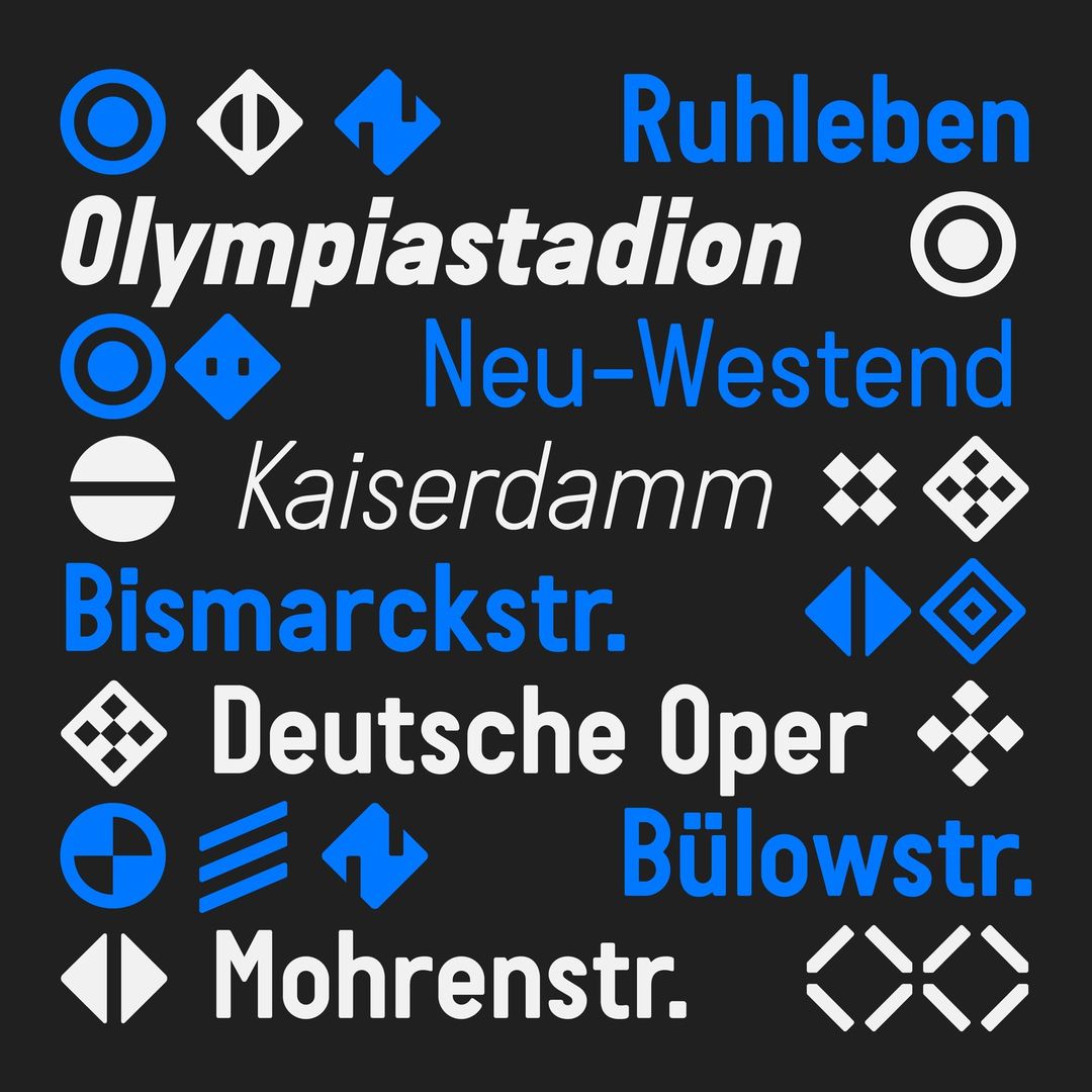
As passionate travelers, Sebastian Bissinger and Laure Boer (BANK™) extensively reference, collect and observe typefaces applied to road, train and wayfinding vernacular on their travels. It was through this constant research that they fell upon the initial reference for Guida—an Italian license plate used somewhere between 1980—1990, existing only in UPPERCASE and numerical forms. The reference contained forms that did not follow optically-driven or corrected expectation, but were drawn through rules of a mechanically dictated process, causing an optical but charming idiosyncratic sensibility. Through testing on a variety of commissions, including a series of video essays that we realized for Time Magazine, New York, we refined many iterations and extended the typeface to include a variety of extra glyphs, forms and alternates, allowing type users further depth and choice.
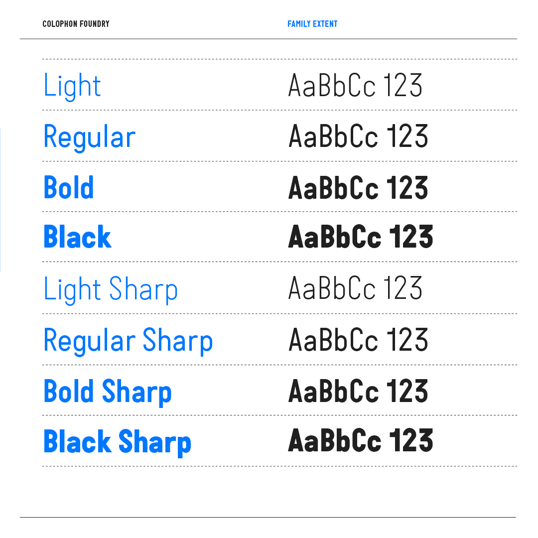
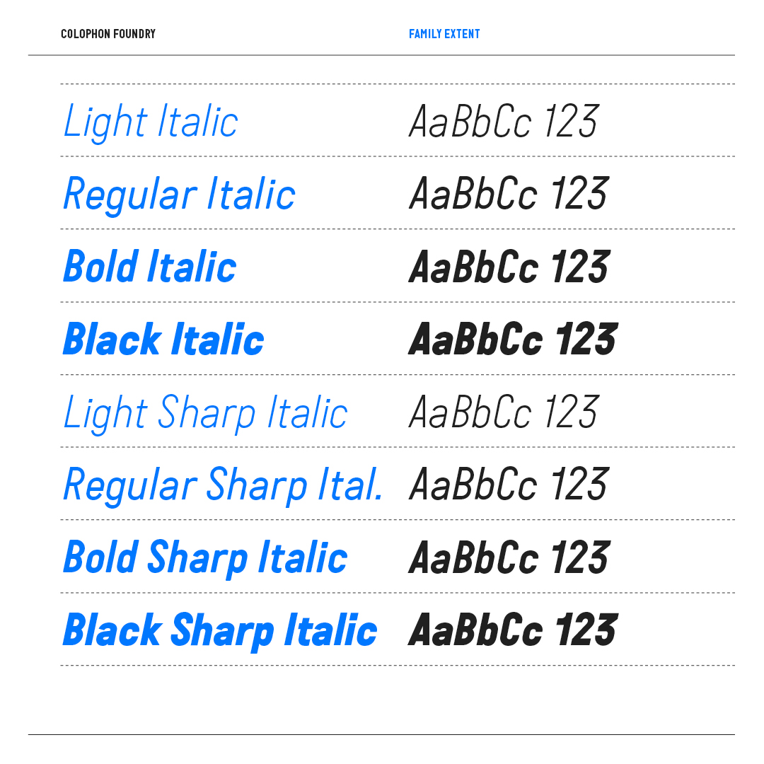
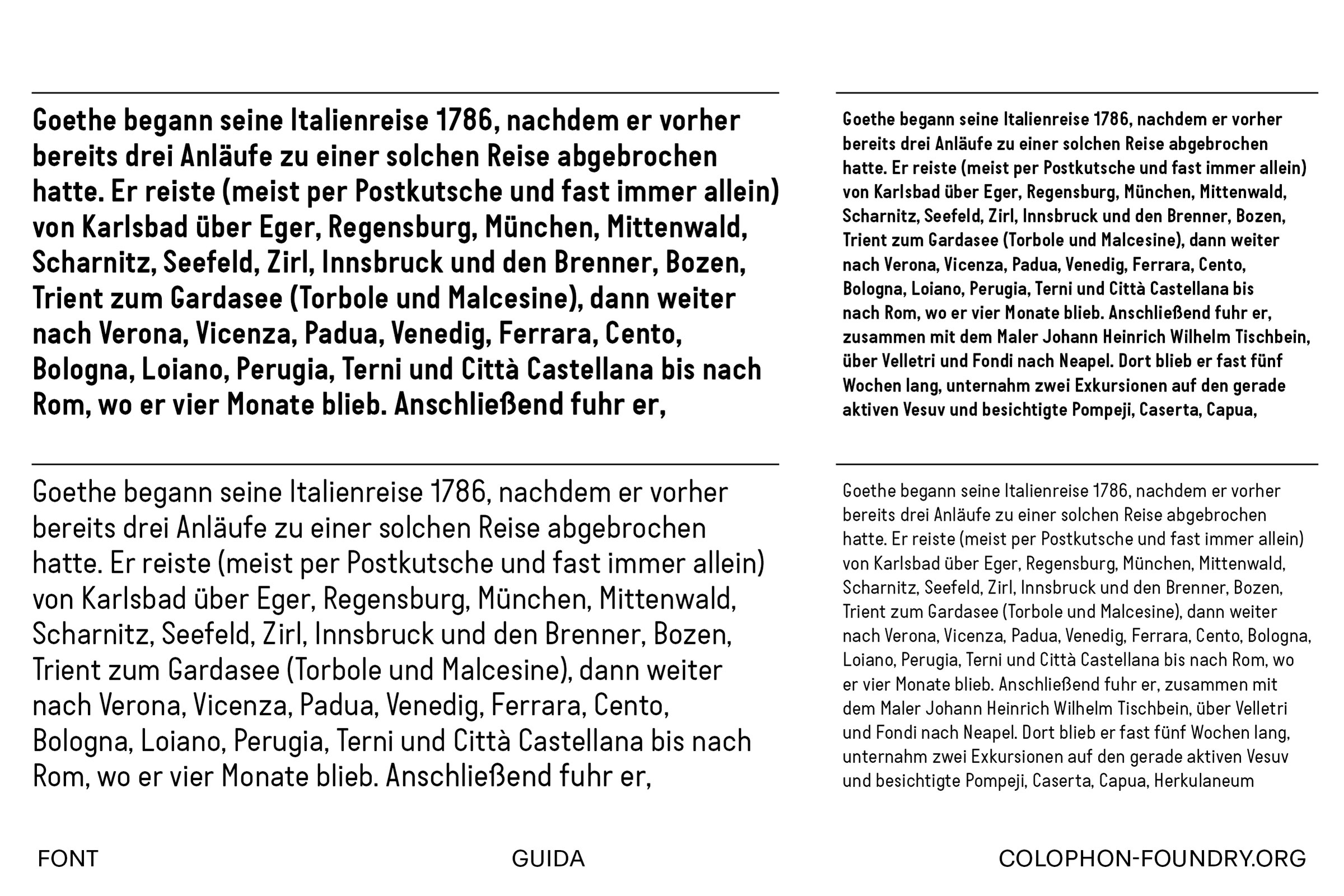
Guida is available in four weights—Light, Regular, Bold and Black—with corresponding italics over two families—Guida, with its characteristic bevelling; and Guida Sharp, a non-bevelled variant. Both have accompanying Monospace cuts. Further help from Milène Laforge means that Guida is now available to license in both Standard (‘STD’) and Professional (‘PRO’) versions, the latter containing a range of additional OpenType features and array of alternate characters.
Available exclusively from Colophon Foundry